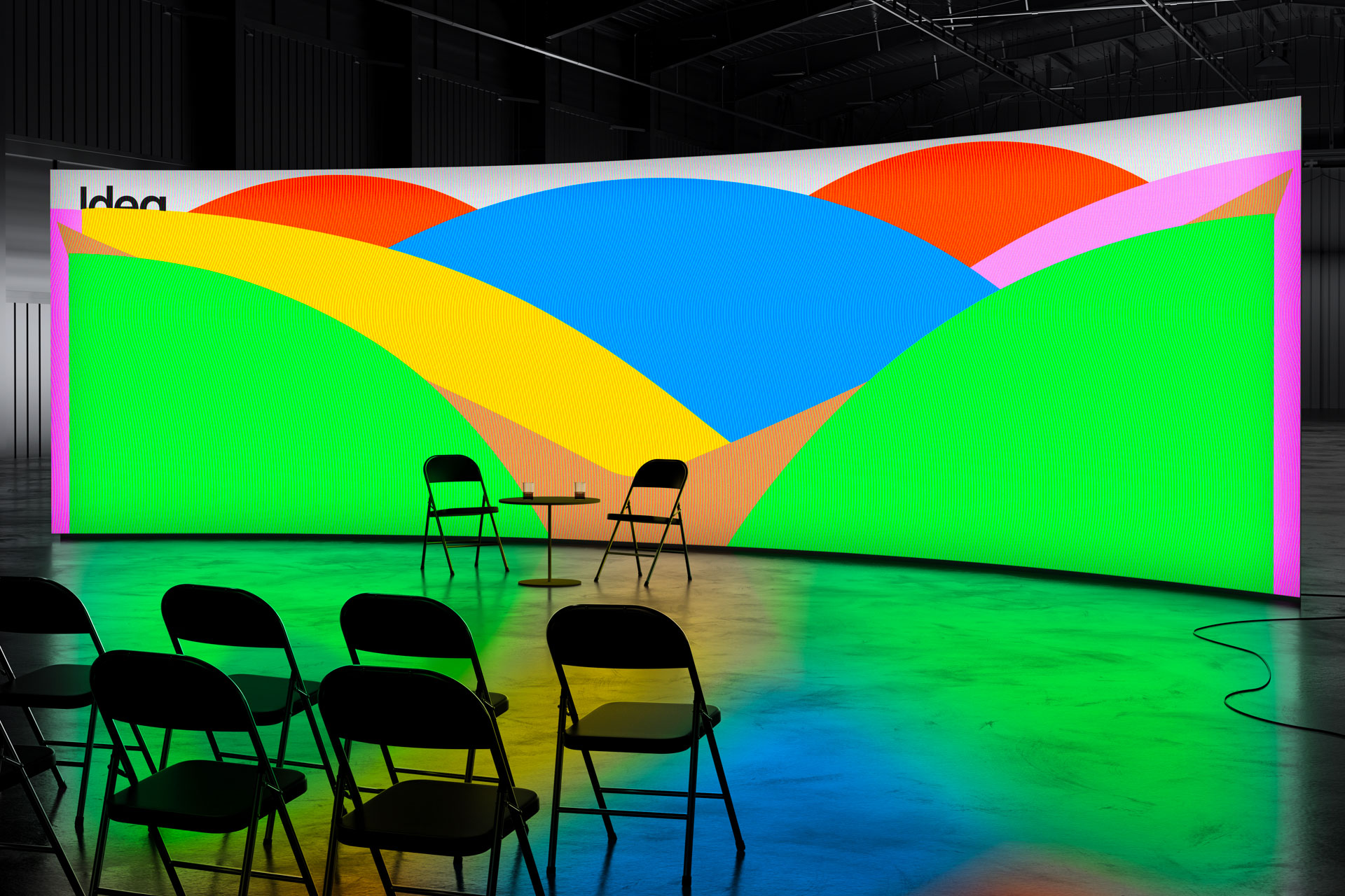
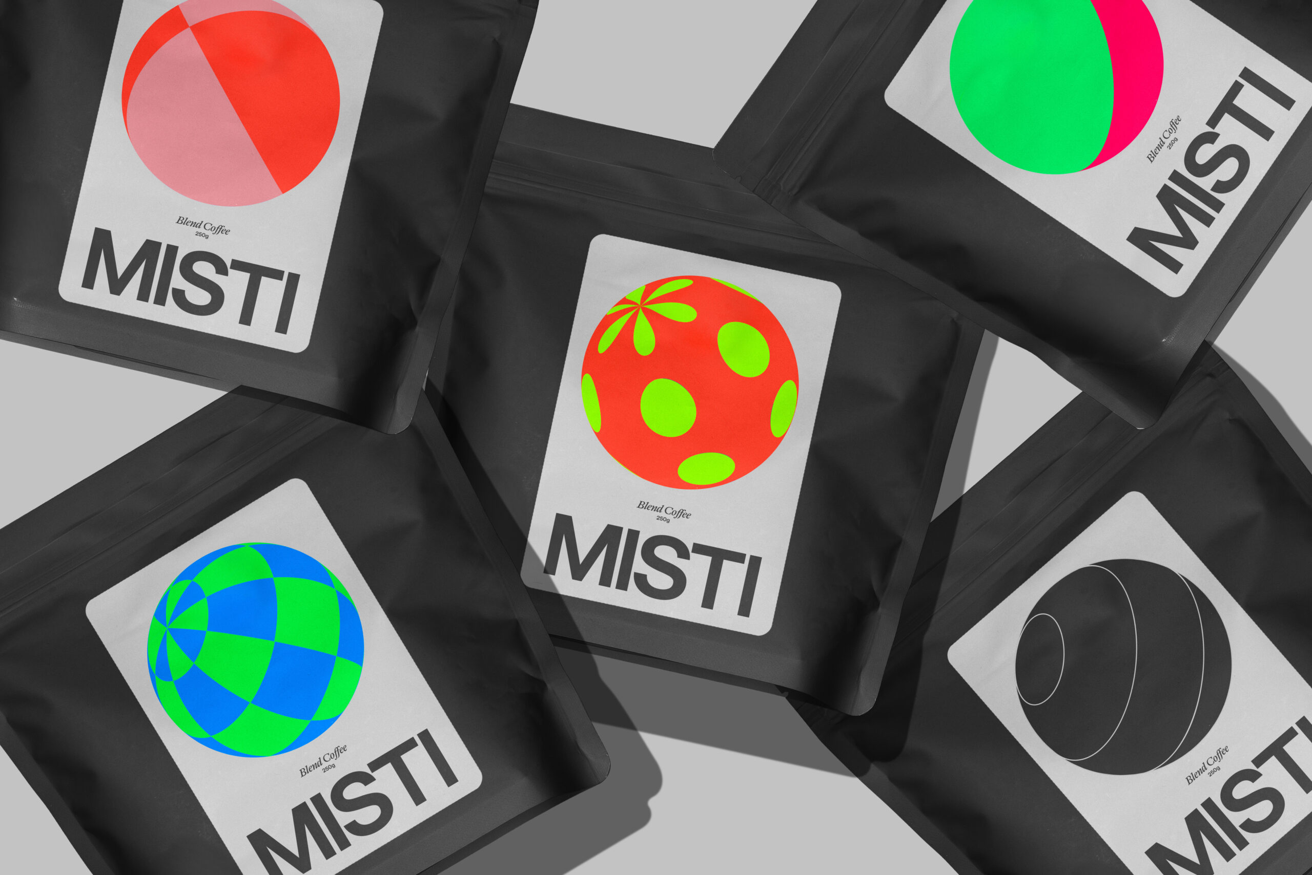
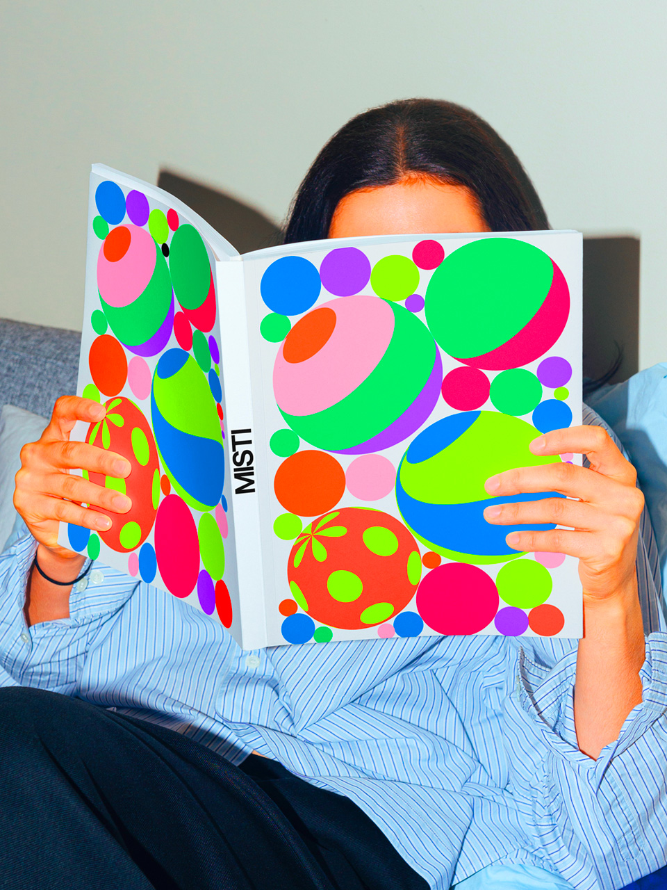
Studio Rejane Dal Bello

  • About
  • Email info@rejanedalbello.com
  • Call +44 07872827645
  • Social Media
    Facebook Instagram Twitter
PROJECTS
SRDB
  • LoveNoobs
  • Tadu
  • Journey of the Mind
  • Paz Walk-in Clinic
  • Annual Report Pandemic
  • Ag2r Citroën Team
  • This Here
  • Branding Highlights
  • Paz Covid-19
  • VR Exhibition
  • UPO 4
  • ACT Runners Book
  • Alzheimer NL
  • Citizen First
  • Making Books Together
  • Trase Finance
  • Reason of Being
  • La Transat 20
  • Sesc AvPaulista
  • Bonne Année
  • Falling Love
  • Foco Course
  • Xmas Free Meals
  • Sesc Cosmos
  • Sesc Casa
  • The Smile Brigade
  • Forget me not Stamp
  • Ready for tomorrow
  • Letify
  • Courtney Barnett
  • 50Y Brasilia
  • UPO 3
  • Ag2r La Mondiale
  • Mundo Latinx
  • Dr. Giraffe Series
  • Tour Bus Ny
  • Play Space
  • Earth Art
  • UPO 2 Magazine
  • La Transat
  • Tour de France
  • City Of Delft
  • Ed Awards
  • Jb 500
  • Free Hospital
  • Faster
  • DDC
  • Symphony
  • Ovg Real Estate
  • Upii Cupcakes
  • Ssh Utrecht
  • New Act
  • LoveNoobs

  • share

Parenting your way 

Visual identity designed for a brand new retail baby products company, “LoveNoobs”. LoveNoobs is a team of experienced baby product creators for every kind of carer of every kind of baby and toddler.

The visual identity was inspired by the double ‘oo’ within LoveNoobs, expressing the wide eyes of a newborn – and of everyone who is a “noobie” to parenting!  Every product, its name, story and packaging, is designed to be genderless but characterful, and is presented as a tool to be used in whatever way is most helpful to a “Big Noob”, caring for a “Little Noob”.

LoveNoobs is a team of experienced baby product creators, designing and manufacturing a range of only-useful goods for every kind of carer of every kind of baby and toddler. They create simple, sustainable products to help carers of babies ‘parent their way’. 

The visual identity was inspired by the double ‘oo’ within LoveNoobs, expressing the wide eyes of a newborn – and of everyone who is a “noobie” to parenting!  Every product, its name, story and packaging, is designed to be genderless but characterful, and is presented as a tool to be used in whatever way is most helpful to a “Big Noob”, caring for a “Little Noob”.

Studio Rejane Dal Bello was invited to create the brand strategy, naming, visual identity, packaging, motion graphics, product and brand videos, Amazon store listings and the assets and template collateral for LoveNoobs’ launch on social media.

SRDB Team
Creative Director, Designer
Rejane Dal Bello

Project Manager
Kerryn Beeching – DashTwo

Strategist & Copywriter
Ben Maxwell

Motion Designer
Everton Guilherme

Illustrator
Rejane Dal Bello

What we have done
Brand and product strategy
Naming
Brand Identity
Textile design
Packaging copywriting & design
Graphic design & production of assets
Film creation – script, storyboard and production
Imagery art direction & shoot production
Social media template design
Amazon product page listing and brand store / shop-front copywriting & design
Illustrations
Launch collateral copywriting & design

  • Tadu

  • share

Rebrand for an architect firm ‘Tadu Architects’ @taduarq

Context
‘Tadu Architects’ has made its mark in the Brazilian and international market over the last 12 years. Previously called ‘TD Architecture’, the company has grown and they saw the need for a realignment of their values to their brand. Studio Rejane Dal Bello was invited to rethink the company naming, strategy, and visual identity system.

Design
Focusing on their core value ‘conscious creations’ (their investigative process through a building’s history before thinking of any design), we designed the word ‘Tadu’ as being seen through all the perspectives and layers in the same way they do with all their projects first. They are known for respecting the heritage and history of the original space, avoiding unnecessary interference, creating cost-effective projects – seeing the big picture and doing more with less.

Studio Rejane Dal Bello
@rejanedalbello (design, web, illustration, and creative direction) in collab with  @chrysostomosnaselos, Ben Maxwell (strategy), @jonathanmnielsen (motion) PV (programmer)

  • Journey of the Mind

  • share

Visual Identity was designed for the Exhibition “Journey of the Mind”, a touring exhibition starting in Birmingham on 18th November 2021.

Context
Concerned with the impact Covid-19 had on our mental health, the Sikh community saw value in sharing the learnings of the Gurus (of whom there are 11 in total) about the mind – understanding it, our ability to control it, and how to find a higher level peace within it for everyone – and how that might be represented through words and art. Studio Rejane Dal Bello was invited to create the visual identity, exhibition and motion graphics, and the collateral for the exhibition tour that starts in Birmingham in November, visiting Glasgow, Bristol, London, Vancouver and with dates for the USA pending confirmation for 2023.

Design
Focusing on the word mind  – the typography lines expand, expressing the journey or path that the mind takes in order to welcome and embrace self-discovery – moving deliberately from the “darkness”  into the “light”.  This journey is what the Gurus teach, to show us how to unlock the meaning of that journey within our own minds. We explore various visuals of the stroke path through motion and across all the exhibition touchpoints, inviting everyone to learn more about the Journey of the Mind.

Studio Rejane Dal Bello

Team 

Creative Director, Designer
Rejane Dal Bello

Project Manager
Kerryn Beeching – DashTwo

Motion Designer
Marcus Pra

Creative Artwork and Production
Henry J Janes

Production Management
Jon Arnold – AMP Production

What we have done
Overarching visual identity
Exhibition graphics
OOH design
Motion design
Social Media design
Collateral design and delivery
Merchandise design and delivery

  • Paz Walk-in Clinic

  • share

Paz Walk-in Clinic was developed during the Pandemic. Studio Rejane Dal Bello was asked to make the supergraphics for the container refurbished for the new clinic standing outside the hospital for quicker diagnosis.

Paz Holandesa is a free children’s hospital in Arequipa, Peru. It was founded in honor of child cancer patient Tony Rojas Molleapaza, whose memory is cherished by the city. 

Our job was to create an identity that could delight, engage and distract the children at the hospital – so we created PAZ and friends – a series of warm, friendly characters who could soften everything from signage to posters all over the building. 

Since 2005, PAZ and friends have gone from logos to stationery, folders, cards and signage, wall paintings, games, and editorial material.

  • Annual Report Pandemic

  • share

Annual report for the French non-profit life insurance company AG2R LA MONDIALE

This is the first report in which we must approach the pandemic head-on and tell the year 2020 with dignity, optimism, and empathy. Embracing the idea that time does not change us, but rather unfolds us. We recommended using only words to convey sorrow, grief, and hope.

In collaboration with Brand Strategist and Consultancy Elodie Boyer @ednonstandard


  • Ag2r Citroën Team

  • share
AG2R Citroën Team – New UniformThe official launch of the uniform that we designed for the  @ag2rlamondiale_procyclingteam team.
Ag2r La Mondiale, a French life insurance company, has a long tradition of sponsoring Tour de France, and this year they welcomed Citroën to be part of their team. Our task was to show this integration by placing Citroên in the heart of the brand, showing that both are here together to help the team succeed.
In partnership with the brilliant @ElodieBoyerFab as their brand consultant and strategist. Design team: Rejane Dal Bello, Chrys Naselos, Julien Tande (motion design), and João Oliveira (3D modeling)
  • This Here

  • share

Rebranding new logo, visual identity, and motion for This Here @thishe.re . A full creative agency, creating across all channels in the Uk.

We created an unrestrained system to ‘Pinpoint What Matters’ and celebrating different perspectives.

Many thanks to Jemima Garthwaite for trusting us with the rebrand as well for This Here team Roanne Toosy, Livvy Moore, and Zöe Hodges.

With Chrys Naselos, Ben Maxwell (Strategy), and Jonathan Nielsen (Motion)

  • Branding Highlights

  • share

A compilation of logos developed throughout my career. To know more about an individual project please go to the specific project page on this website and find out more. Thank you for visiting.

  • Paz Covid-19

  • share

Annual Report & Campaign  Covid-19 2020

Paz Holandesa is a free children’s hospital in Arequipa, Peru. It was founded in honor of child cancer patient Tony Rojas Molleapaza, whose memory is cherished by the city. 

Our job was to create an identity that could delight, engage and distract the children at the hospital – so we created PAZ and friends – a series of warm, friendly characters who could soften everything from signage to posters all over the building. 

Since 2005, PAZ and friends have gone from logos to stationery, folders, cards and signage, wall paintings, games, and editorial material.

  • VR Exhibition

  • share

Design for Yes, We Have Bananas 🍌 VR Exhibition
Runs from today till 23rd of May 2020


  • UPO 4

  • share

Editorial design and Cloud Type design for the new UPO 4 magazine- Reading the Sky – from publisher @ednonstandard and featuring artist Finnish artist Aino-Maija Metsola

This publication is available at:
www.editions-non-standard.com

Words from the Editor Elodie Boyer about the project:

This UPO 4 (Unidentified Paper Object) Reading The Sky shows watercolours of the Finnish artist Aino-Maija Metsola, together with stanzas written “on site” by Daniel de Roulet, translated into English with delicacy by Pierre Rusch. Rejane Dal Bello is the designer of this UPO 4, just like for the first three other UPOs. She has shaped it as a type specimen. We believe that beauty is our last resort. We also fight against the idea of borders. In this UPO, there is no territory dedicated to text, design nor art, we intertwin the authors and their productions for our immense pleasure. The paper is actually the last author, showing a new side of the book through its amazing opacity/ transparency. Enjoy

All was left to do was to get the pieces together. We had the text, we had the images, we had the title: Reading the sky. Rejane Dal Bello took the title literally, she went on from there to design an alphabet, typography called Cloud. So what you’re holding in your hands is a specimen of the printing character Cloud 1. You’re starting to identify a pattern, Rejane Dal Bello has left her publisher’s trace in designing the UPOs, one can recognize her rhythm, her flow, her space. I hope this UPO, by its beauty, will help heal our rainy bodies.”

Authors
Elodie Boyer (editor), Aino-Maija Metsola (“artist”), Studio Rejane Dal Bello (designer & cloud type). Author of the text: Daniel de Roulet. Translator (from French into English): Pierre Rusch.

Mel Duarte (Photographer)

  • ACT Runners Book

  • share
AG2R Citroën Team Runners Book.
Ag2r La Mondiale, a French life insurance company, has a long tradition of sponsoring Tour de France, and this year they welcomed Citroën to be part of their team. Our task was to show this integration by placing Citroên in the heart of the brand, showing that both are here together to help the team succeed.
In partnership with the brilliant @ElodieBoyerFab as their brand consultant and strategist. Photography by Benjamin Schmuck
  • Alzheimer NL

  • share

A memorable challenge

The advance of Alzheimers and other forms of dementia are one of the greatest challenges the world is facing. The Alzheimer Nederland Foundation plays a vital role in raising awareness and funds for research.

The disease causes significant memory loss – so our design work explores the physical and emotional impact, creating a distinctive visual identity that was used across all the Foundation’s communication.

Project developed while working at Studio Dumbar

  • Citizen First

  • share

Written by Rejane Dal Bello

After a career of more than 20 years spanning four countries, globally-renowned graphic designer, illustrator and visual branding consultant Rejane Dal Bello explains how choosing (or being chosen by) a design career has come to matter to her – and how it can matter to others no matter whether they are also seeking a creative path or are simply curious about the value and possibilities afforded by creativity.

Through a mixture of personal anecdote and professional experience, Rejane honestly and emotively reflects on her life and processes, and how they have been shaped by the beauty, challenges and serendipity of design and the visual arts.

You can order at:

https://www.counter-print.co.uk

Author/ writter: Rejane Dal Bello
Publisher: Counter-print books

  • Making Books Together

  • share

 We Designed for the Exhibition ‘Making Books Together’  Edition Non-Standard publisher  France, Le Havre @Saisongraphique

  • Trase Finance

  • share

We designed a series of icons using the trase.earth logo as our starting point, to help viewers navigate through the data platform more efficiently and coherently.

trase.earth is an online platform that provides a supply chain information system for companies, governments, investors, and other actors seeking to transition towards more sustainable production, trade, and consumption for the world´s major forest-risk agricultural commodities.

With Chrys Naselos, Hemmo (Dutch Icon) and motion designer Dimitris Papadimitriou.

  • Reason of Being

  • share

Annual report for the French non-profit life insurance company AG2R LA MONDIALE

Embracing the idea that time does not change us, but rather unfolds us. This was our starting point for 2019’s annual report.

In collaboration with Chrysostomos Naselos
Strategy Elodie Boyer.

  • La Transat 20

  • share

Visual identity for the French sailing race La Transat sponsored by ALM. Using the visual cue from ALM’s main brand identity, we reintroduced the ALM fold as a colourful and vibrant sail in order to mark this year’s event.

In collaboration with @chrysostomosnaselos
Strategy: Elodie Boyer
Motion: Julien Tande & @dimitriskp
Sound: @whydobirds.de

  • Sesc AvPaulista

  • share

Democratic learning

SESC is a Brazilian non-profit that sees education as a vital part of social transformation. They provide a diverse range of free educational programmes for all kinds of people. It’s the most important cultural and education institution in Sao Paulo.

We created an editorial system for printed and digital material, to be used throughout the 12-month duration of the courses – work that celebrated all shapes and sizes of learning.

  • Bonne Année

  • share

Xmas cards for the French non-profit life insurance company AG2R LA MONDIALE.

Studio Rejane Dal Bello worked in partnership with brand consultant & strategist Elodie Boyer
with Chrys Naselos

  • Falling Love

  • share

‘Falling Love’ is an animation developed for the Motion Festival @demo.festival in Amsterdam of 24h Motion.

  • Foco Course

  • share

The new school year, new identity @curso_foco FOCO (Focus) a University preparatory school in Niterói, Rio de Janeiro.

  • Xmas Free Meals

  • share

Free Christmas Meals & Entertainement communition style that has being developed as a visual identity system for the past two xmas.

The Smile Brigade is a non-profit voluntary organisation offers vulnerable people a range of help and services – everything from freshly cooked meals to haircuts.

Our visual identity work graphically represents the idea of people working together. It’s moving, simple and welcoming.

  • Sesc Cosmos

  • share

Exploring the universe

This poster wrapped the monthly brochure, and was designed to promote special courses about space. This design places the cosmos within an image which becomes 3D when it’s moved and folded by a reader – referencing the multi-dimensional nature of the cosmos.

  • Sesc Casa

  • share

There’s no place like home

This project celebrated the home – the courses, workshops, and other activities SESC devised for creating household objects.

The design references the creative process of building things from scratch – the joy of making something that’s uniquely yours.

  • The Smile Brigade

  • share

Building community

This non-profit voluntary organisation offers vulnerable people a range of help and services – everything from freshly cooked meals to haircuts.

Our visual identity work graphically represents the idea of people working together. It’s moving, simple and welcoming.

  • Forget me not Stamp

  • share

Stamp designed for the theme of not forgetting your elderly relatives. Forget me not.

Designed while working at Studio Dumbar

  • Ready for tomorrow

  • share

Ready for tomorrow

This project is the design of the 2018 ALM annual report.

It’s a simple idea – images of human hands, of all ages. They represent the humanity of ALM clients at different stages of their lives.

In collaboration with Chrys Naselos

  • Letify

  • share

Lettings made simple

Letify is an online platform that simplifies the lettings process for landlords – it allows them to customize the way they manage properties.

The design had to be as simple as the product – so we made their letter ‘E’ into a house. It created a brand device that allows Letify to stand out in all their comms, across any visual platform, simply by writing their name. Bold, straightforward and honest.

In collaboration with Chrysostomos Naselos

  • Courtney Barnett

  • share

New Tour poster promotion for Australian’s most famous Punk Rock singer, Courtney Barnett.

  • 50Y Brasilia

  • share

Half a century of influence

This project was a visual identity to celebrate the 50th anniversary of
the city of Brasilia.

We were inspired by Palácio do Congresso Nacional, one of the most iconic buildings in the city. We took the lines, shapes and forms of the building and abstracted them into blocks, which we used to create the number 50.

  • UPO 3

  • share

Write your name

Every year, UPO III (Unidentified Paper Object) showcases an undiscovered artist working on a social project.

We created the identity for UPO and also designed this third edition, which featured Marion Baitalle. This amazing artist helps children to write their names in a non-traditional way, so they feel there is no room to fail.

It’s something we’re really proud to have been a part of.

  • Ag2r La Mondiale

  • share

Life unfolding

ALM is a French life insurance company that is non-profit – its purpose is to support its members through the difficult times in their lives. The design adapted the existing, iconic logo into a new context, with engaging photography and a vibrant, versatile colour palette. It speaks to the life of a customer, and ALM’s job to help them ‘unfold’ the crucial moments in their lives.

In collaboration with Chry Naselos

  • Mundo Latinx

  • share

Populist passion

The Mundo Latinx exhibition showcased contemporary visual artists who raise important questions about Latin American society.

We chose to honour their work by referencing the aesthetics of the wheatpaste poster – the cheapest, most popular form of communication found throughout the continent.

The exhibition was held at the Fashion Space Gallery part of the London College of Fashion.

  • Dr. Giraffe Series

  • share

Explaining an illness to a child, whether common or serious, is no easy feat. It’s something every parent must do, but knowing what to say and how to say it, can be a huge challenge. Often, they simply don’t have the medical knowledge needed to explain a disease and provide much-needed comfort.

This is where Dr. Giraffe comes in. With simple words and pictures, and grounded in medical truth, each book in the series tells a story about one childhood disease – ranging from common ailments to rare conditions. To mum and dad’s relief, Dr. Giraffe can do what they perhaps cannot: help young patients make sense of what they are going through, in a way that is clear, medically accurate, and (no less importantly) pleasant to read.

Where to find them (Print & Ebook)
https://amzn.to/2RhOhRN

Our collection so far:
— Mr. Dot: chicken pox
— Half-half: cleft palate and lip
— Land of the Big: leukaemia

Created, illustrated, designed & published by
Studio Rejane Dal Bello

Words & story by
Jayshree Viswanathan

Medical strategy by
Stefan Liute

Supported by
Marjan van Mourik

More information
drgiraffe.com

  • Tour Bus Ny

  • share

Standing out in NYC

Open Tour is a New York bus sightseeing brand – working in one of the noisiest, busiest, most visually demanding cities in the world. Making yourself seen is a huge challenge.

But they have something other brands don’t: a fleet of giant moving billboards, where the product and the brand are one.

Visitors to NYC want to feel totally immersed – so we created the most American-looking busses in the world. They stand out, even in the heaviest traffic.

Elodie Boyer strategy consultancy has invited Studio Rejane Dal Bello to work on it in collaboration with graphic designer and professor Danny Kreeft.

  • Play Space

  • share

Solving problems through play

Playspace is an organisation that empowers employees to understand, challenge and change the rules that govern their lives and society.

Our work was inspired by the idea of gamification – the joy of solving problems through play. We created a typographical set of shapes that playfully adapts to each framework.

  • Earth Art

  • share

Rejane Dal Bello has been assembling images from Google Earth in her spare time. Then she has energetically re-arranged, re-worked and illustrated them; re-mixed them and turned them inside out, transforming their meaning in the process and reference of the history of art through earth perspective.

As happy as an astronaut, Rejane has been able to capture a new perspective to present images of infinity and to fashion the world in her imagination. This unique project which should be a novel and intriguing reading experience.

Collaboration for 3D creative animation with Aaron Baum and Sound design with Lucas Rampazzo.

  • UPO 2 Magazine

  • share

UPO (Unidentified Paper Object) is an occasional and bilingual printed matter (FR/EN) published by Éditions Non Standard. UPO is aimed at emphasizing a non-standard project from an “undiscovered” artist. To wrap this artistic project, Elodie Boyer chooses one or several authors to write a specific text and Rejane Dal Bello creates a unique graphic design. As a result, UPO is hopefully a moving, shaking, an experimental and unexpected meeting place. UPO format remains the same but paper(s), printing technique(s), binding vary from one issue to another.

UPO 2 is dedicated to the work of the photographer Xenia Naselou. She gives us a glimpse of what is happening, on the island of Lesvos in Greece, observed with a beautiful sensitivity, without being intrusive to those who been through so much on the immigration crisis. A silent documentation of the traces it has left.

  • La Transat

  • share

Standing out in a sea of competitors

Ag2r La Mondiale (ALM) is a key sponsor of La Transat, a prestigious international yacht race. But it’s a huge sponsorship area for many finance companies – it’s hard for brands not get lost in the crowd.

We decided to ignore every financial branding cliche, and take inspiration from the world of yacht racing. We used the visual alphabet of sailing flags to create a design system that positioned ALM as a bold, expressive and decisive leader.

Project developed while working at Studio Dumbar

  • Tour de France

  • share

A moving design target

How do you create an identity that works when it’s always moving? Our work for the Ag2r La Mondiale (ALM) Tour De France team meant branding objects that most people see flying past on their screens.

The strength of this identity lies in the iconic logo, the expressive typography and the bold use of colour. We purposely avoided the visual clichés associated with the financial sector and chose to reference the dot pattern of the Tour jerseys as a tribute to the event.

Project developed while working at Studio Dumbar

  • City Of Delft

  • share

Ancient and modern

This project is a visual identity for the city of Delft in Holland. Our brief was to represent the rich history of the city and its innovative character, in one.

The logo blends traditional typography with new characters. We used historical and modern silhouettes of Delft, referenced its local products and created typography that uses both a sans serif and a refined serif font. And the use of drawn illustration represents a city that is always developing. It’s
an honest, heartfelt celebration.

Project developed while working at Studio Dumbar

  • Ed Awards

  • share

Driving debate

Design is not only about aesthetics, it also plays a vital role in society. The 2010 European Design Festival took place amid seismic political changes, and we felt our work should address those issues.

We were inspired by the visual language of protest movements and European flags, and created work that made the audience part of the discussion.

  • Jb 500

  • share

Honouring a master

We created a proposal for the visual identity for the Dutch city of Den Bosch. It’s a place synonymous with the celebrated artist Hieronymus Bosch, and the 500th anniversary of his death in 1516.

His work is known for its deep insight into humanity’s desires and deepest fears – our design reflected the duality of his art and his city in a series of arresting images.

  • Free Hospital

  • share

Made for Tony

Paz Holandesa is a free children’s hospital in Arequipa, Peru. It was founded in honour of child cancer patient Tony Rojas Molleapaza, whose memory is cherished by the city.

Our job was to create an identity that could delight, engage and distract the children at the hospital – se we created PAZ and friends – a series of warm, friendly characters who could soften everything from signage to posters
all over the building.

Since 2005, PAZ and friends have gone from logos to stationery, folders, cards and signage, wall paintings, games and editorial material.

  • Faster

  • share

Faster is a motorcycle store based in Rio de Janeiro where it sells motorcycle garment and parts.

  • DDC

  • share

Exchanging ideas

This project celebrated an international exchange between Dutch and Chinese colleges. The type is deliberately chosen to clash, so it represents the imperfections and unpredictability that makes collaboration interesting.

Dutch design college is an initiative by Michel de Boer

  • Symphony

  • share

How to be heard

The Amsterdam Symphony has an enviable international reputation and a broad repertoire, performing everything from baroque to contemporary music.

Our posters for the Symphony were driven by a bold logotype and typographic palette. It allowed us to showcase dramatically different artists and performances while retaining a strong, instantly recognisable identity.

Project developed while working at Studio Dumbar

  • Ovg Real Estate

  • share

Shaping cities

OVG is a Dutch real estate developer with an innovative approach. The needs of a city to flex, to adapt, to constantly change – that’s what fires OGV’s imagination and work.

We approached this project with that flexibility in mind, and created an identity that shows OGV as a modern, fluid and positive contributor to civic life.

Project developed while working at Studio Dumbar

  • Upii Cupcakes

  • share

A sweet little something

This charming visual identity was developed for a cupcake shop based in Brazil, feeding everyone from children at parties to wedding guests.

It’s all about celebration. Love hearts, confetti, kisses…every element of this identity is designed to put you in a good mood. Let the happiness begin!

  • Ssh Utrecht

  • share

SSH Utrecht is a social housing organization for young people and students, mostly from the university and the various colleges in Utrecht. The main focus of the concept is ‘individuality versus community’ – meaning several students, with different backgrounds and characters, living together and sharing the same space. Photos by Gerrit Schreurs.

Project designer while at Studio Dumbar

  • New Act

  • share

Stencil Book is a self Publications book from Rejane Dal Bello portfolio.

BACK TO TOP