Parenting your way
Visual identity designed for a brand new retail baby products company, “LoveNoobs”. LoveNoobs is a team of experienced baby product creators for every kind of carer of every kind of baby and toddler.
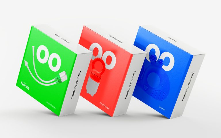
The visual identity was inspired by the double ‘oo’ within LoveNoobs, expressing the wide eyes of a newborn – and of everyone who is a “noobie” to parenting! Every product, its name, story and packaging, is designed to be genderless but characterful, and is presented as a tool to be used in whatever way is most helpful to a “Big Noob”, caring for a “Little Noob”.
LoveNoobs is a team of experienced baby product creators, designing and manufacturing a range of only-useful goods for every kind of carer of every kind of baby and toddler. They create simple, sustainable products to help carers of babies ‘parent their way’.
The visual identity was inspired by the double ‘oo’ within LoveNoobs, expressing the wide eyes of a newborn – and of everyone who is a “noobie” to parenting! Every product, its name, story and packaging, is designed to be genderless but characterful, and is presented as a tool to be used in whatever way is most helpful to a “Big Noob”, caring for a “Little Noob”.
Studio Rejane Dal Bello was invited to create the brand strategy, naming, visual identity, packaging, motion graphics, product and brand videos, Amazon store listings and the assets and template collateral for LoveNoobs’ launch on social media.
SRDB Team
Creative Director, Designer
Rejane Dal Bello
Project Manager
Kerryn Beeching – DashTwo
Strategist & Copywriter
Ben Maxwell
Motion Designer
Everton Guilherme
Illustrator
Rejane Dal Bello
What we have done
Brand and product strategy
Naming
Brand Identity
Textile design
Packaging copywriting & design
Graphic design & production of assets
Film creation – script, storyboard and production
Imagery art direction & shoot production
Social media template design
Amazon product page listing and brand store / shop-front copywriting & design
Illustrations
Launch collateral copywriting & design