Context
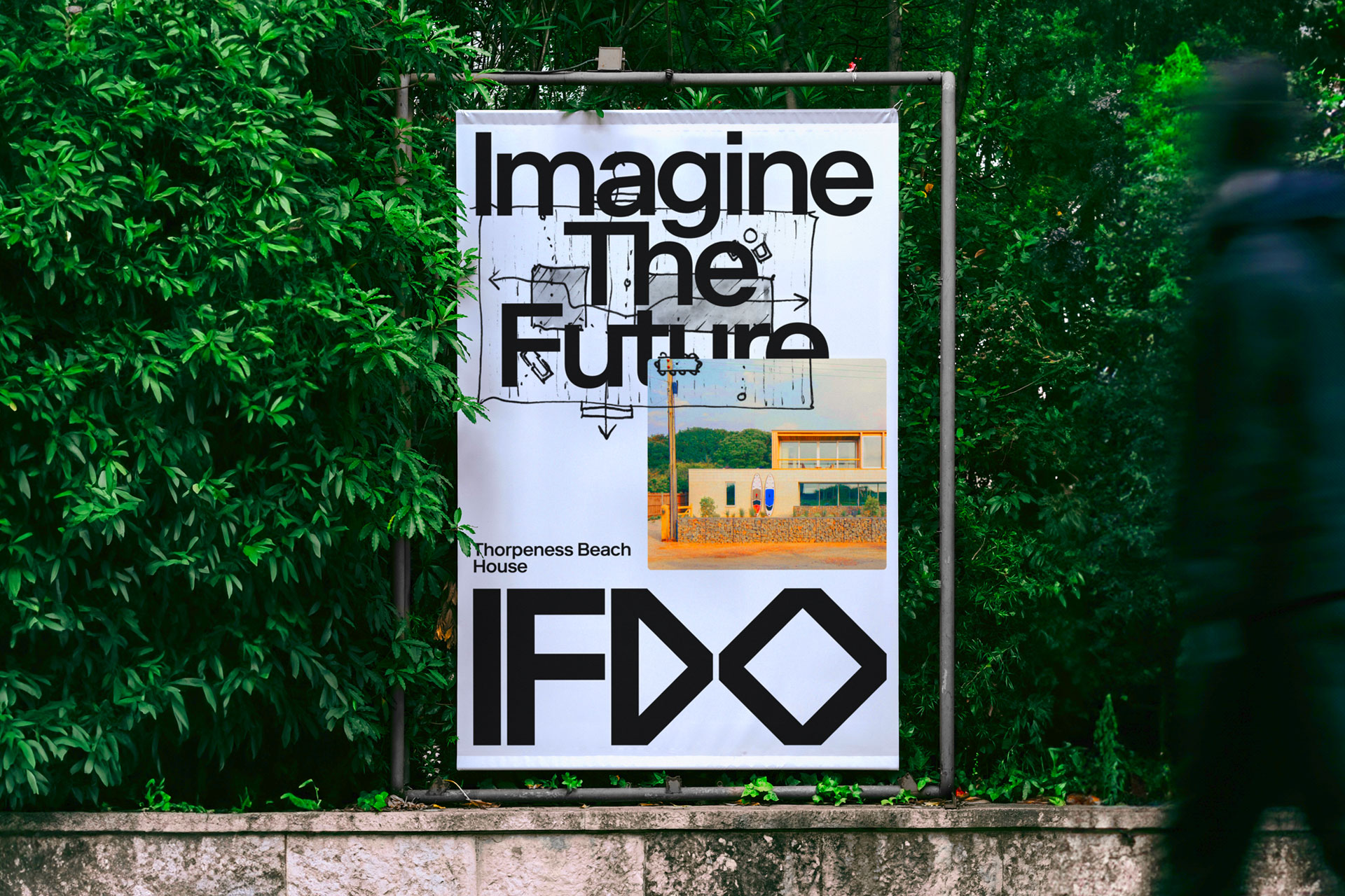
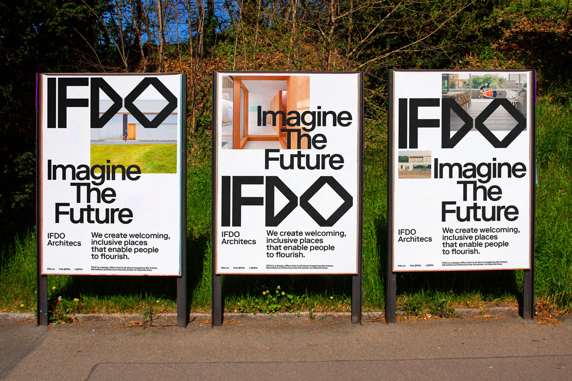
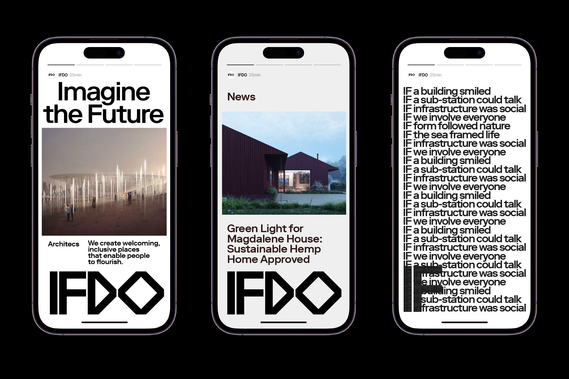
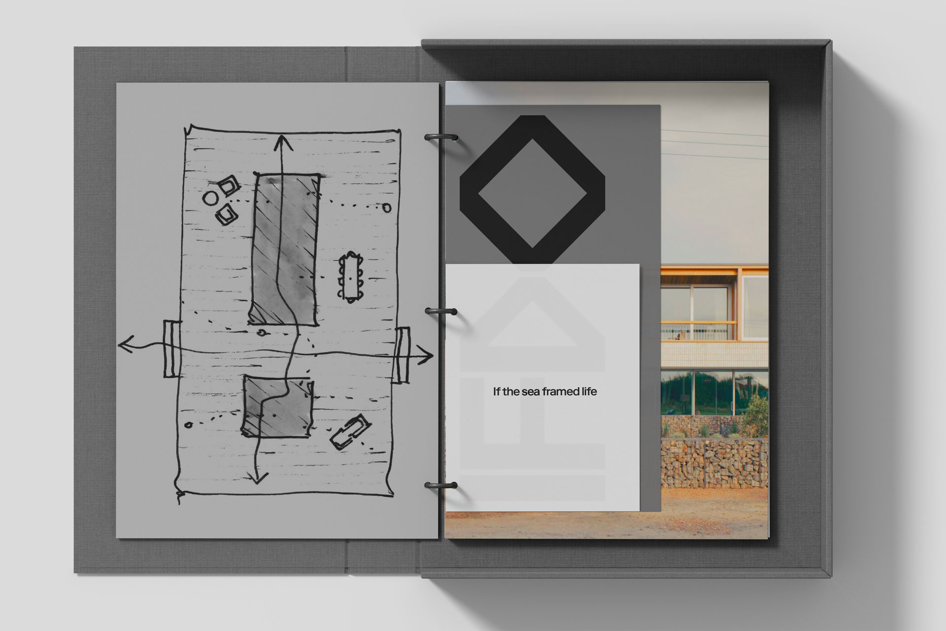
IFDO is an architecture practice dedicated to imagining the future. Their work begins with a simple yet powerful premise: every project starts with a question. What if we think differently? What if we involve everyone? What if we try something new? Through questioning, listening, and exploring possibilities, IFDO creates inclusive, welcoming spaces designed to help people and communities flourish. At the heart of their philosophy is a belief that architecture can genuinely improve lives — and that imagination is the first step toward building a better future.
Design
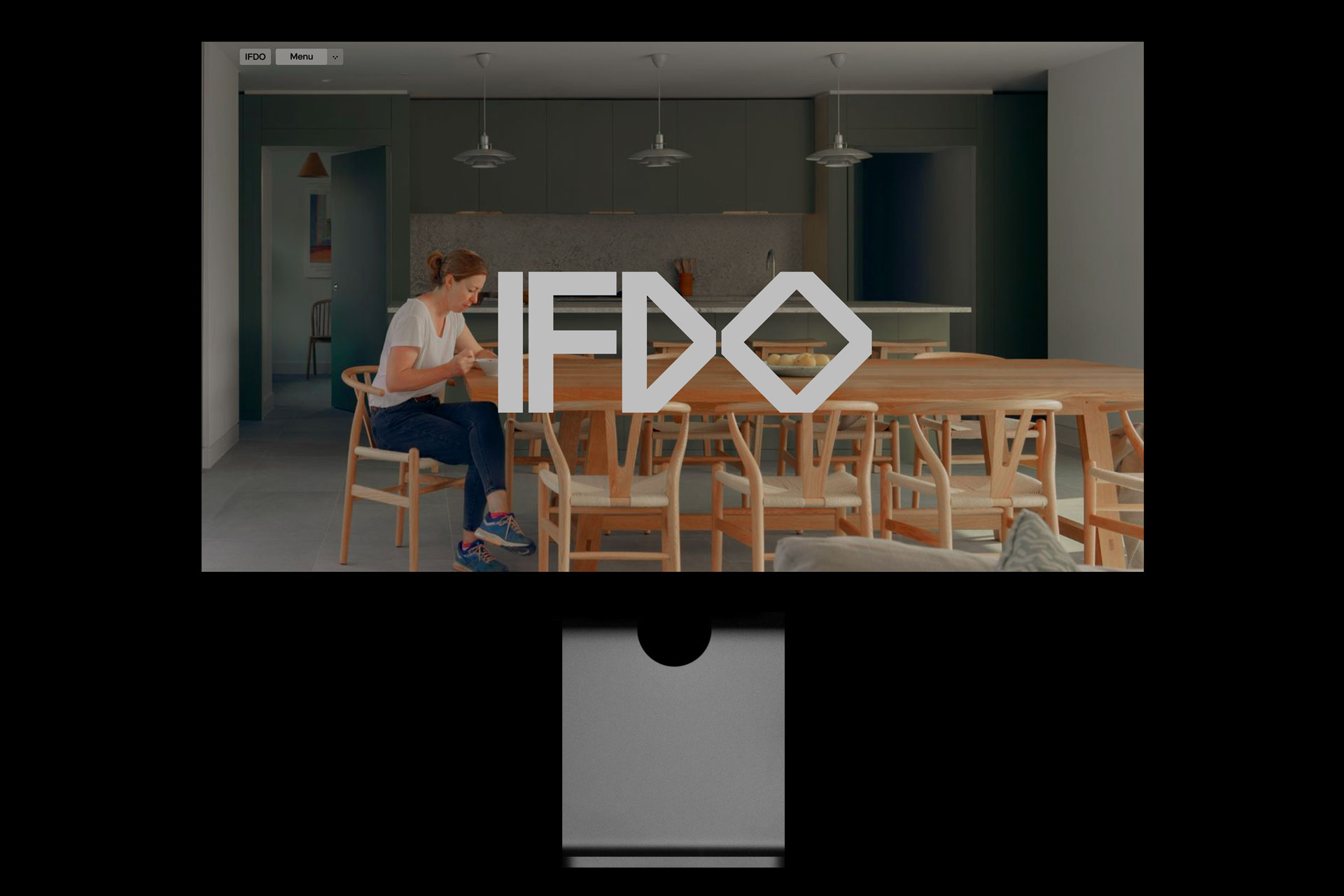
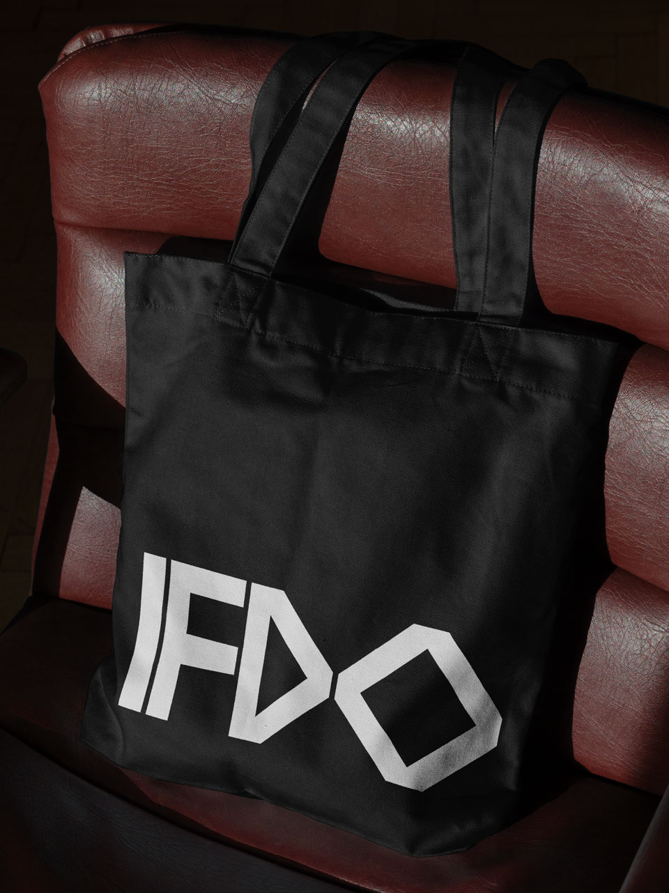
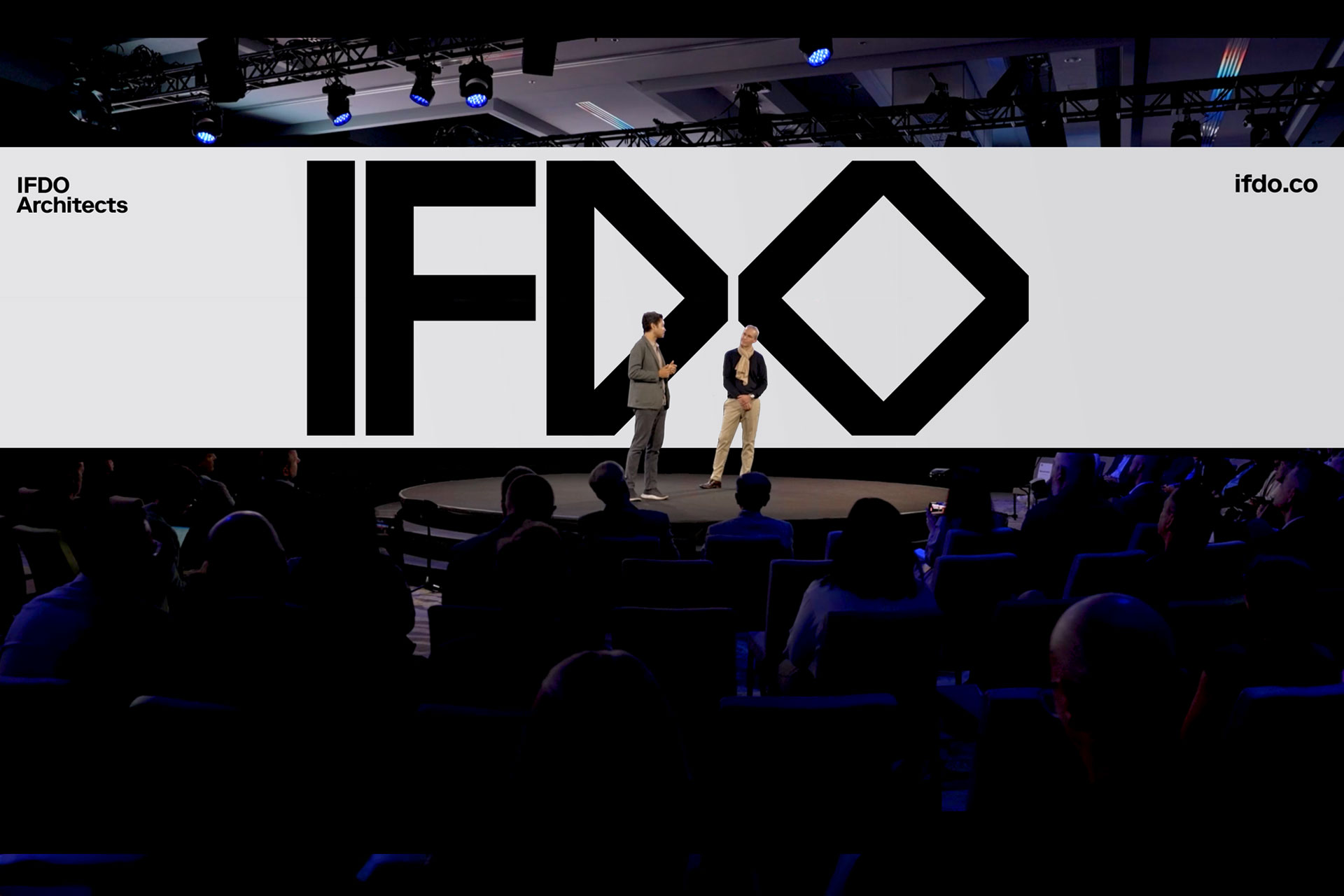
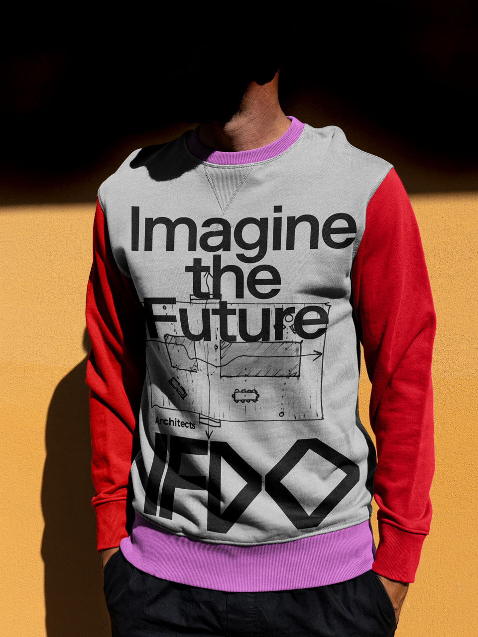
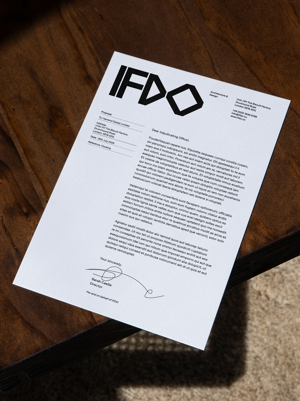
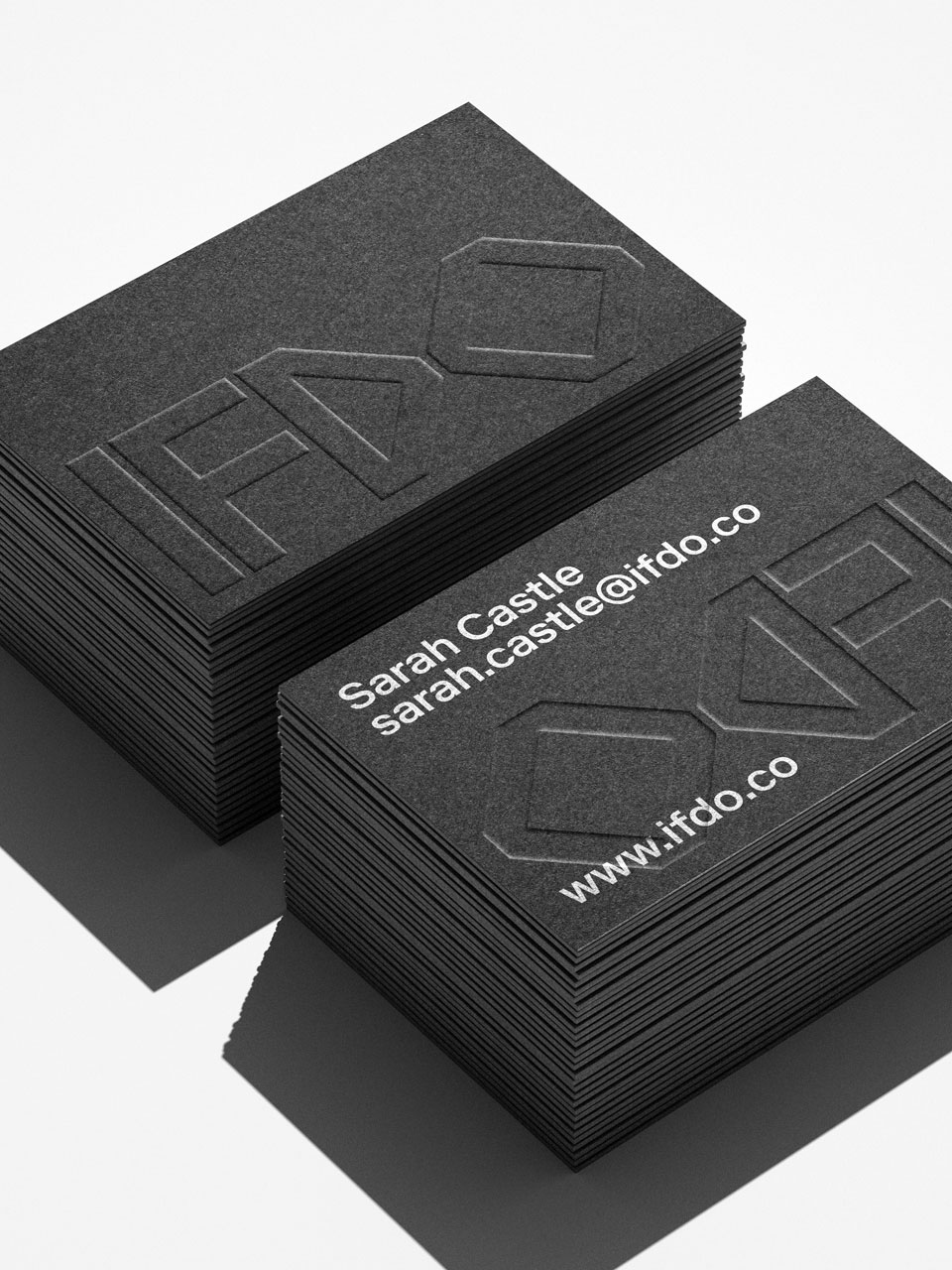
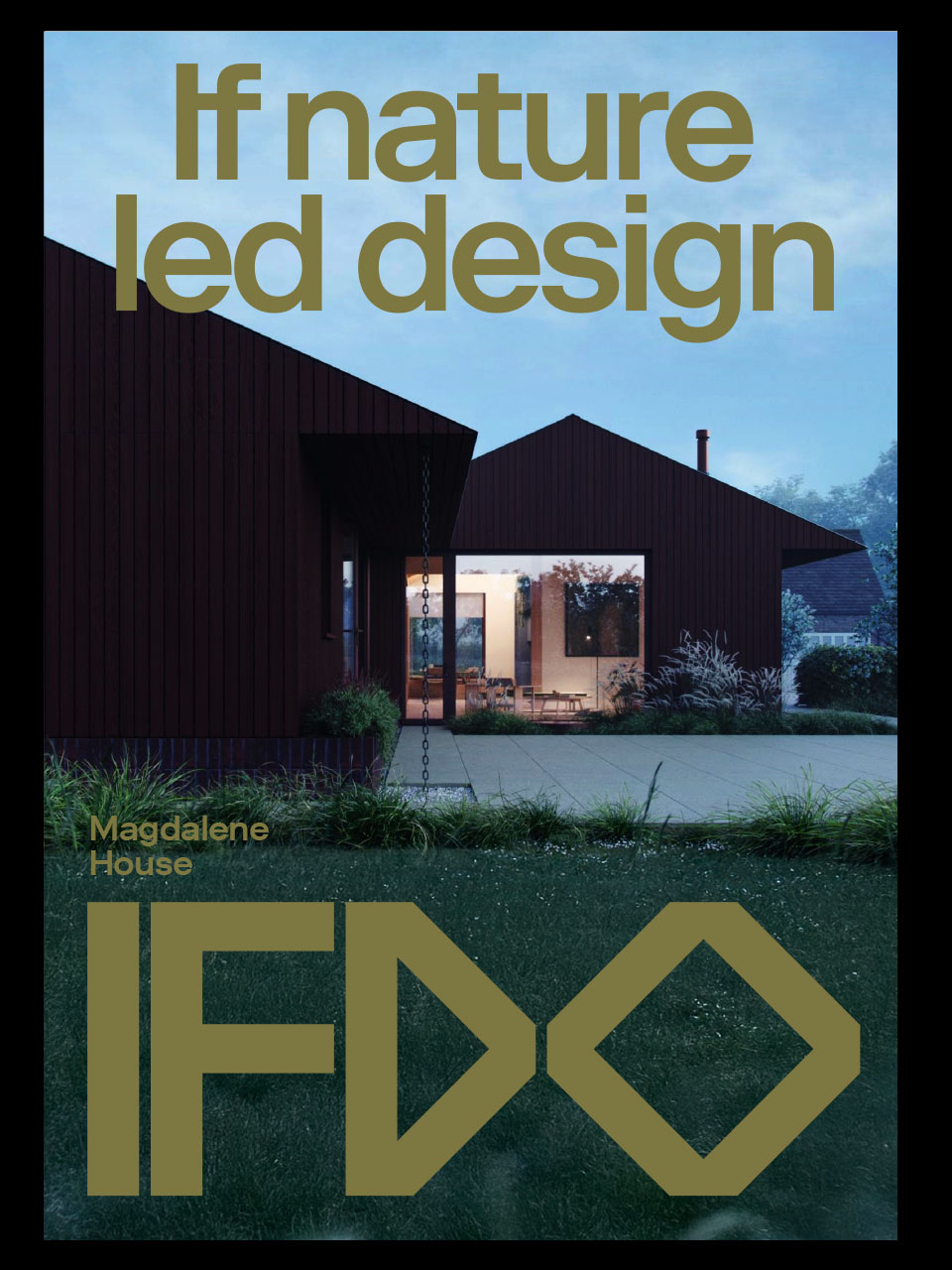
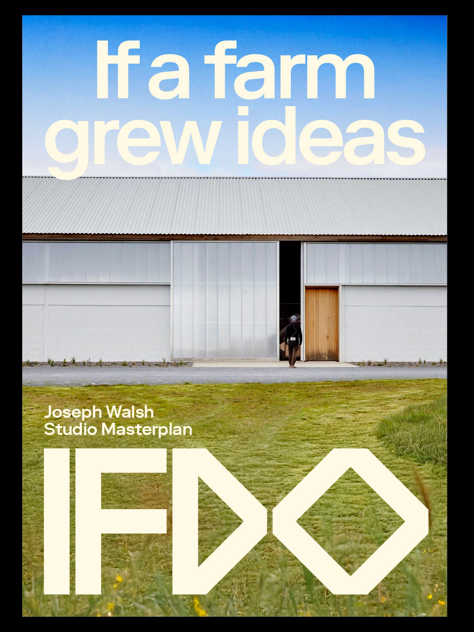
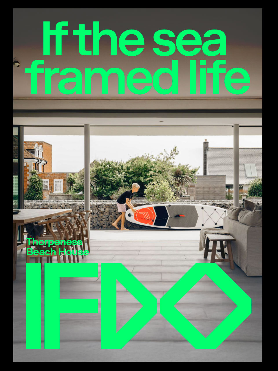
We developed the IFDO logotype as the central, instantly recognisable symbol of the brand. Rooted in the clarity of sans-serif typography, the design balances simplicity with meaning. The “IF” embodies curiosity — the spark of every idea and a direct reference to the studio’s guiding question, “What if?” In contrast, the “DO” transitions into more geometric forms, echoing architectural planning and purposeful action; the “D,” shaped like an arrow, reinforces direction, progress, and momentum. Together, the logotype captures the dual essence of IFDO: a practice where questioning leads to action, and imagination becomes architecture.
Services
- Brand Strategy
- Branding
- Digital & Social Design
- Digital Design
- Visual Identity
Team
-
Creative Director, DesignerRejane Dal Bello
-
StrategistBen Maxwell
-
Project ManagerMelissa Taminato
-
Motion DesignerCharlie Le Maignan & Bettina Lou Lou
-
Digital DesignRejane Dal Bello
-
ProgrammerLoja Interativa